End of Year Exhibiton Logbook: Entry 8
Monday, June 09, 2014
This entry is to do with my self branding again! This one shares more of my computer development that I done throughout the past few weeks and my final logo! I will hopefully get to implementing this design on this blog once college is finished but in the mean time- enjoy!
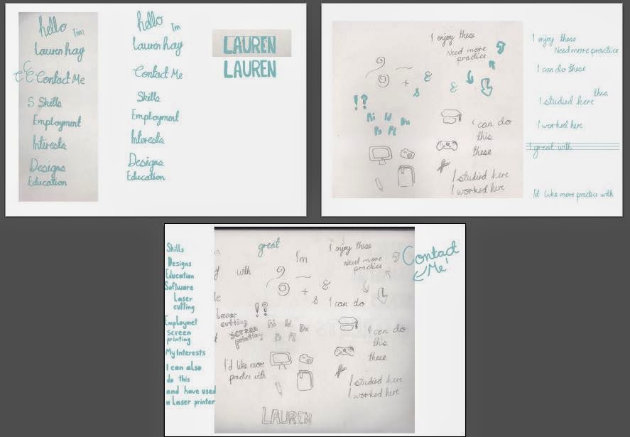
These were some of my more major pieces of development focusing on my own hand writing.I tried formatting it in a few ways but ultimitaly went back to the original kind of look that reflects my hand writing- slantyness! I also knew from the start that I would be using either a blue, green, or a mixture of the two with a grey but once I started developing my CV a hint of pink has been brought in.
I also did try include elements like the flowers but felt they didn't perceive me in the right way. I have ended up going for another little symbol to include but I think I'll save that to include in either the post about my CV/business cards.
The image above was also some development that I had done. Although it didn't really have much to do with my branding it was done for producing my CV. In the end I felt that the chunky lettering that appear more in the bottom art board was a lot more of what I feel represents me better compared to the loopy writing like in the first two art boards. I do realise that this is contradicting to the fact that my logo is of loopy nature but I wanted that to be an organic piece. Also, I feel that the chunky lettering compliments the branding well, which you will see in the CV!
But now for the drumroll....
This is my final logo! It does look fairly boring here with nothing around it . But in the most basic form this is it. Once this has been put on business cards and all the rest it does look a lot better with extra definition and stuff.
I hope you like what I've produced so far, this process has been really exciting for me so far and I can't wait to share all the rest with you!


0 comments